How to use {nichetools}

Stable Isotopes
Trophic Dynamics
Food Webs
Author

Benjamin L. Hlina

Published

March 15, 2024

0.1 Our Objectives

The purpose of this vignette is to use {nicheROVER} and {nichetools} to extract and then visualize estimates of trophic niche size and similarities for multiple freshwater fish using {ggplot2}.

This vignette can be used for additional purposes including estimating niche size and similarities among different groups of aquatic and/or terrestrial species. Furthermore, niche size and similarities for different behaviours exhibited within a population can be made using behavioural data generated from acoustic telemetry (e.g., differences in habitat occupancy).

0.2 Bring in trophic niche data

First we will load the necessary packages to preform the analysis and visualization. We will use {nicheROVER} and {nichetools} to preform the analysis. We will use {dplyr}, {tidyr}, and {purrr} to manipulate data and iterate processes. Lastly, we will use {ggplot2}, {ggtext}, and {patchwork} to plot, add labels, and arrange plots.

I will add that many of the {dplyr} and {tidyr} functions and processes can be replaced using {data.table} which is great when working with large data sets.

{
  library(dplyr)
  library(ggplot2)
  library(ggtext)
  library(ggh4x)
  library(nicheROVER) 
  library(nichetools)
  library(patchwork)
  library(purrr)
  library(stringr)
  library(tidyr)
}
Warning: package 'ggplot2' was built under R version 4.3.3
Warning: package 'ggh4x' was built under R version 4.3.3

For the purpose of the vignette we will be using the fish data frame that is available within {nicheROVER}. We will remove \(\delta\)34S for simplicity of the vignette. If more than two isotopes or metrics are being used to compare niche sizes and similarities, please use the functions for each pairing. Right now some functions (i.e., niche_ellipse()) in {nichetools} doesn’t have the ability to work with more than two isotopes. This will become a feature at some point but for now. Please be patient and use the functions for each pairing you have.

We will first use the function janitor::clean_names() to clean up column names. For your purposes you will need to replace fish with your data frame either by loading a csv, rds, or qs, with your data. You can do this multiple ways, I prefer using readr::read_csv() but base R’s read.csv() works perfectly fine.

df <- fish %>% 
  janitor::clean_names()

If there are any isotopic values that did not run and are NA, they will need to be removed because {nicheROVER}’s functions will not accommodate values of NA.

0.3 Estimate posterior distribution with Normal-Inverse-Wishart (NIW) priors.

We will take 1,000 posterior samples for each group. You can change this but suggest nothing less than 1,000.

nsample <- 1000

We will then split the data frame into a list with each species as a data frame object within the list, We will then iterate over the list, using map() from {purrr}, to estimate posterior distribution using Normal-Inverse-Wishart (NIW) priors.

fish_par <- df %>% 
  split(.$species) %>% 
  map(~ select(., d15n, d13c)) %>% 
  map(~ niw.post(nsample = nsample, X = .))

0.4 Extract μ values

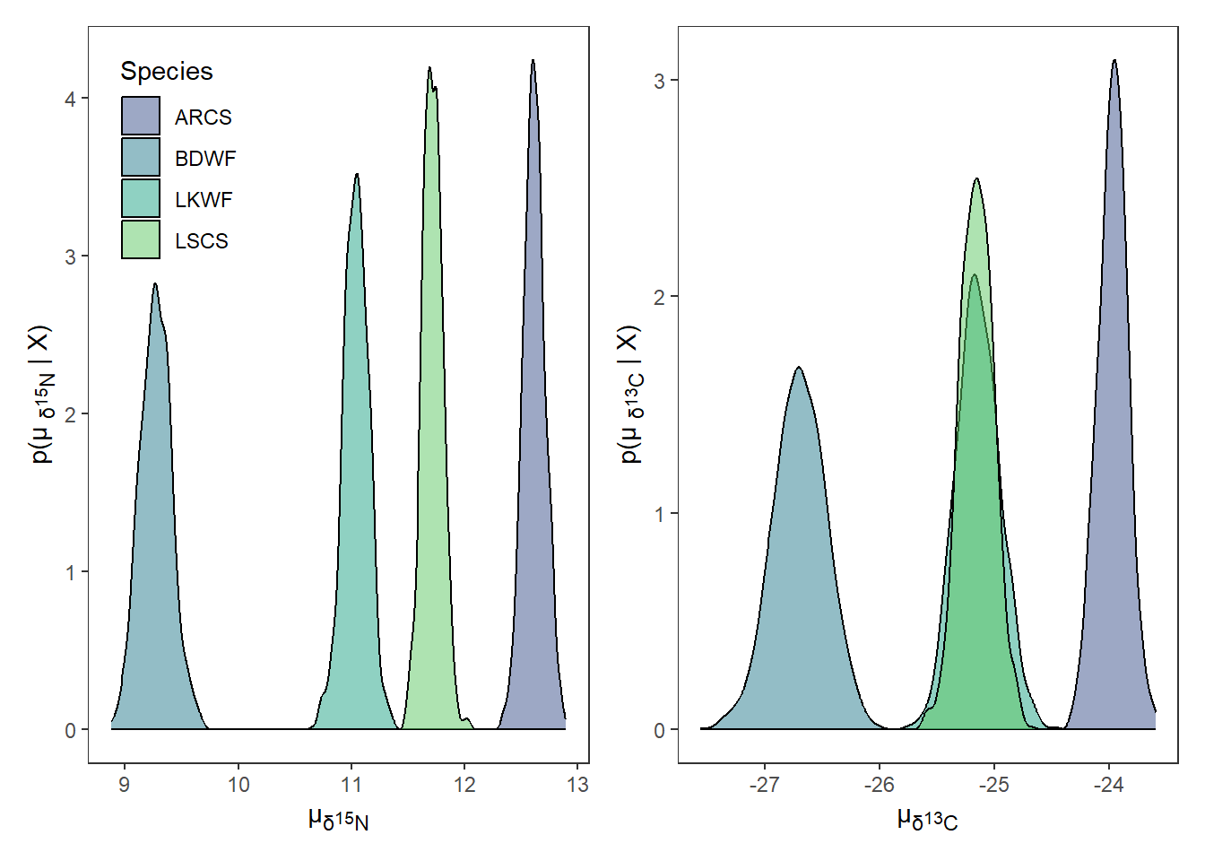
We will use extract_mu()to extract posteriors for \(\mu\) estimates. The default output of extract_mu() is long format which works for plotting with {ggplot2} and other functions in {nichetools}. If we want wide format we can specify the argument format with "wide", however, it is unlikely you will need this data in wide format.

df_mu <- extract_mu(fish_par)

The default output will be lacking some info for plotting. We will need to add in a column that is the element abbreviation and neutron number to be used in axis labeling.

df_mu <- df_mu %>%
  mutate(
    element = case_when(
      isotope == "d15n" ~ "N",
      isotope == "d13c" ~ "C",
    ), 
    neutron = case_when(
      isotope == "d15n" ~ 15,
      isotope == "d13c" ~ 13,
    ) 
  )

0.5 Extract Σ values

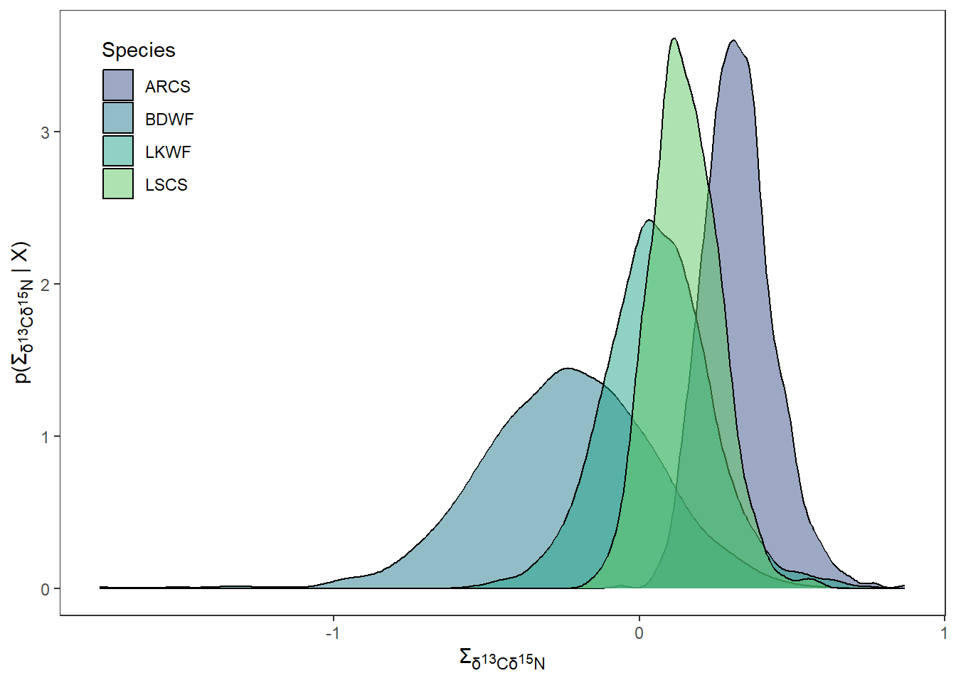
We will use extract_sigma() to extract posterior estimates for \(\Sigma\). The default output of extract_sigma() is wide format which doesn’t work for plotting with {ggplot2} but does work other functions in {nichetools}. If we want long for plotting we can specify the argument format with "long".

df_sigma <- extract_sigma(fish_par)

For plotting we will need the extracted \(\Sigma\) values to be in long format. We also need to remove \(\Sigma\) values for when the both isotope columns are the same isotope.

df_sigma_cn <- extract_sigma(fish_par, 
                             format = "long") %>%
  filter(id != isotope)

0.6 Plot posterior distrubtion of μ and Σ

For most plotting within this vignette, I will split() the data frame by isotope, creating a list that I will then use imap() to iterate over the list to create plots. We will use geom_density() to represent densities for both \(\mu\) and \(\Sigma\). Plot objects will then be stored in a list.

First we will plot \(\mu\) for each isotope. We will use {patchwork} to configure plots for multi-panel figures. This package is phenomenal and uses math operators to configure and manipulate the plots to create multi-panel figures.

For labeling we are also going to use element_markdown() from {ggtext} to work with the labels that are needed to correctly display the isotopic signature. If you are working other data please replace.

posterior_plots <- df_mu %>%
  split(.$isotope) %>%
  imap(
    ~ ggplot(data = ., aes(x = mu_est)) +
      geom_density(aes(fill = sample_name), alpha = 0.5) +
      scale_fill_viridis_d(begin = 0.25, end = 0.75,
                           option = "D", name = "Species") +
      theme_bw() +
      theme(panel.grid = element_blank(),
            axis.title.x =  element_markdown(),
            axis.title.y =  element_markdown(),
            legend.position = "none",
            legend.background = element_blank()
      ) +
      labs(
        x = paste("\u00b5<sub>\U03B4</sub>", "<sub><sup>",
                  unique(.$neutron), "</sup></sub>",
                  "<sub>",unique(.$element), "</sub>", sep = ""),
        y = paste0("p(\u00b5 <sub>\U03B4</sub>","<sub><sup>",
                   unique(.$neutron), "</sub></sup>",
                   "<sub>",unique(.$element),"</sub>",
                   " | X)"), sep = "")
  )

posterior_plots$d15n +
  theme(legend.position = c(0.18, 0.82)) + 
  posterior_plots$d13c

For labeling purposes we need to add columns that are the element abbreviation and neutron number. I do this by using case_when() which are vectorized if else statements.

df_sigma_cn <- df_sigma_cn %>%
  mutate(
    element_id = case_when(
      id == "d15n" ~ "N",
      id == "d13c" ~ "C",
    ),
    neutron_id = case_when(
      id == "d15n" ~ 15,
      id == "d13c" ~ 13,
    ),
    element_iso = case_when(
      isotope == "d15n" ~ "N",
      isotope == "d13c" ~ "C",
    ),
    neutron_iso = case_when(
      isotope == "d15n" ~ 15,
      isotope == "d13c" ~ 13,
    )
  )

Next we will plot the posteriors for \(\Sigma\).

sigma_plots <- df_sigma_cn %>%
  group_split(id, isotope) %>%
  imap(
    ~ ggplot(data = ., aes(x = post_sample)) +
      geom_density(aes(fill = sample_name), alpha = 0.5) +
      scale_fill_viridis_d(begin = 0.25, end = 0.75,
                           option = "D", name = "Species") +
      theme_bw() +
      theme(panel.grid = element_blank(),
            axis.title.x =  element_markdown(),
            axis.title.y =  element_markdown(),
            legend.position = "none"
      ) +
      labs(
        x = paste("\U03A3","<sub>\U03B4</sub>",
                  "<sub><sup>", unique(.$neutron_id), "</sub></sup>",
                  "<sub>",unique(.$element_id),"</sub>"," ",
                  "<sub>\U03B4</sub>",
                  "<sub><sup>", unique(.$neutron_iso), "</sub></sup>",
                  "<sub>",unique(.$element_iso),"</sub>", sep = ""),
        y = paste("p(", "\U03A3","<sub>\U03B4</sub>",
                  "<sub><sup>", unique(.$neutron_id), "</sub></sup>",
                  "<sub>",unique(.$element_id),"</sub>"," ",
                  "<sub>\U03B4</sub>",
                  "<sub><sup>", unique(.$neutron_iso), "</sub></sup>",
                  "<sub>",unique(.$element_iso),"</sub>", " | X)", sep = ""),
      )
  )

sigma_plots[[1]] + 
  theme(legend.position = c(0.1, 0.82))

0.7 Estimate niche ellipse

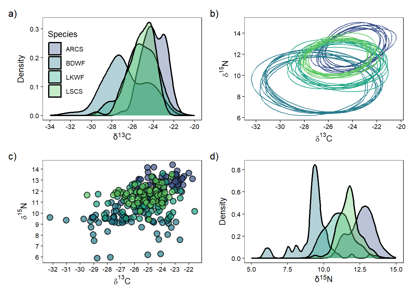
We then will use niche_ellipse() to easily extract ellipse for each \(\Sigma\) estimate (i.e., 1000). If you are to have additional isotopes or metrics, you will need to create mu and sigma objects for each pairing, as currently this function only handles two isotopes. In the future, there likely will be the ability to specify the number of isotopes you have with the default being two. The reason for the lack of functionality is ellipse::ellipse() can only work within two-dimensions, not three, so you will have to create multiple ellipse() calls for each combination of isotopes or metrics and I haven’t had the time to implement this. The function will also tell you how long it took to process as with large sets of isotope data it is nice to know the time it takes for the function to work.

ellipse_df <- niche_ellipse(dat_mu = df_mu, dat_sigma = df_sigma)
→ Total time processing was 5.16 secs

We will randomly sample 10 ellipses out of 1,000. You can change this but this seems pretty standard.

set.seed(14)

random_ellipse <- ellipse_df %>% 
  group_by(sample_name, sample_number) %>% 
  nest() %>%
  group_by(sample_name) %>% 
  slice_sample(n = 10, replace = TRUE) %>% 
  ungroup() %>% 
  unnest(cols = c(data))  

0.8 Plot ellipses, densities of each istope, and isotope biplot

We will first plot the ellipse for each sample_name

ellipse_plots <- ggplot() + 
  geom_polygon(data = random_ellipse,
               mapping = aes(x = d13c, y = d15n,
                             group = interaction(sample_number, sample_name),
                             color = sample_name),
               fill = NA,
               linewidth = 0.5) + 
  
  scale_colour_viridis_d(begin = 0.25, end = 0.75, 
                         option = "D", name = "species",
  ) + 
  scale_x_continuous(breaks = rev(seq(-20, -40, -2))) +
  scale_y_continuous(breaks = seq(6, 16, 2)) +
  theme_bw(base_size = 10) +
  theme(axis.text = element_text(colour = "black"),
        panel.grid = element_blank(), 
        legend.position = "none", 
        legend.title = element_text(hjust = 0.5),
        legend.background = element_blank()) + 
  labs(x = expression(paste(delta ^ 13, "C")), 
       y = expression(paste(delta ^ 15, "N")))

We need to turn df into long format to iterate over using imap() to easily create density plots. You will notice that I again use case_when() to make columns of element abbreviations and neutron numbers that will be used in plot labeling.

iso_long <- df %>%
  pivot_longer(cols = -species,
               names_to = "isotope", 
               values_to = "value") %>% 
  mutate(
    element = case_when(
      isotope == "d15n" ~ "N",
      isotope == "d13c" ~ "C",
    ), 
    neutron = case_when(
      isotope == "d15n" ~ 15,
      isotope == "d13c" ~ 13,
    )
  )

We will then make density plots for each isotope using geom_density()

iso_density <- iso_long %>% 
  group_split(isotope) %>% 
  imap(
    ~ ggplot(data = .) + 
      geom_density(aes(x = value, 
                       fill = species), 
                   alpha = 0.35, 
                   linewidth = 0.8) +
      scale_fill_viridis_d(begin = 0.25, end = 0.75,
                           option = "D", name = "Species") +
      theme_bw(base_size = 10) +
      theme(axis.text = element_text(colour = "black"),
            panel.grid = element_blank(), 
            legend.position = c(0.15, 0.55), 
            legend.background = element_blank(), 
            axis.title.x = element_markdown(family = "sans")) + 
      labs(x =  paste("\U03B4",
                      "<sup>", unique(.$neutron), "</sup>",unique(.$element), 
                      sep = ""), 
           y = "Density")
  )

d13c_density <- iso_density[[1]] + 
  scale_x_continuous(breaks = rev(seq(-20, -34, -2)),
                     limits = rev(c(-20, -34)))

d15n_density <- iso_density[[2]] +
  scale_x_continuous(breaks = seq(5, 15, 2.5), 
                     limits = c(5, 15)) + 
  theme(
    legend.position = "none"
  )

Lastly we will use geom_point() to make isotopic biplot.

iso_biplot <- ggplot() + 
  geom_point(data = df, aes(x = d13c, y = d15n,
                            fill = species),
             shape = 21, colour = "black", 
             stroke = 0.8,
             size = 3, alpha = 0.70) +
  scale_fill_viridis_d(begin = 0.25, end = 0.75,
                       option = "D", name = "species") +
  scale_x_continuous(breaks = rev(seq(-20, -39, -1))) +
  scale_y_continuous(breaks = seq(5, 17, 1)) +
  theme_bw(base_size = 10) +
  theme(axis.text = element_text(colour = "black"),
        panel.grid = element_blank(), 
        legend.position = "none", 
        legend.background = element_blank()) + 
  labs(x = expression(paste(delta ^ 13, "C")), 
       y = expression(paste(delta ^ 15, "N")))

0.9 Use {patchwork} to make ellipse, density, and biplots into a paneled figure.

We can also use the function plot_annotation() to add lettering to the figure that can be used in the figure description. To maneuver where plot_annotation() places the lettering, we need to add plot.tag.position = c(x, y) to the theme() call in every plot.

d13c_density + ellipse_plots + iso_biplot + d15n_density +
  plot_annotation(tag_levels = "a", 
                  tag_suffix = ")")

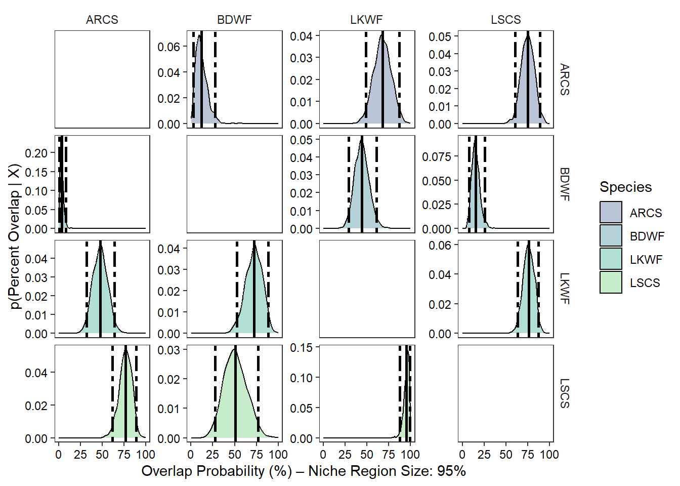
0.10 Determine the 95% niche similarties for each species

We will use the overlap() function from {nicheROVER} to estimate the percentage of similarity among species. We will set overlap to assess based on 95% similarities.

over_stat <- overlap(fish_par, nreps = nsample, nprob = 1000, 
                     alpha = 0.95)

We then are going transform this output to a data frame using extract_overlap() plotting so we can assess overall similarities among species.

over_stat_df <- extract_overlap(data = over_stat) %>% 
    mutate(
      niche_overlap_perc = niche_overlap * 100
  )

We then are going to take our newly made data frame and extract out the mean percentage of similarities and the 2.5% and 97.5% quarantines. We plot these as lines and dotted lines on our percent similarity density figure.

over_sum <- over_stat_df %>% 
  group_by(sample_name_a, sample_name_b) %>% 
  summarise(
    mean_niche_overlap = round(mean(niche_overlap_perc), digits = 2),
    qual_2.5 = round(quantile(niche_overlap_perc, probs = 0.025, na.rm = TRUE), digits = 2), 
    qual_97.5 = round(quantile(niche_overlap_perc, probs = 0.975, na.rm = TRUE), digits = 2)
  ) %>% 
  ungroup() %>% 
  pivot_longer(cols = -c(sample_name_a, sample_name_b, mean_niche_overlap), 
               names_to = "percentage", 
               values_to = "niche_overlap_qual") %>% 
  mutate(
    percentage = as.numeric(str_remove(percentage, "qual_"))
  ) 

We are now going to use ggplot(), geom_density(), and fact_grid2() from {ggh4x}.

ggplot(data = over_stat_df, aes(x = niche_overlap_perc)) + 
  geom_density(aes(fill = sample_name_a)) + 
  geom_vline(data = over_sum, aes(xintercept = mean_niche_overlap), 
             colour = "black", linewidth = 1) +
  geom_vline(data = over_sum, aes(xintercept = niche_overlap_qual), 
             colour = "black", linewidth = 1, linetype = 6) +
  scale_fill_viridis_d(begin = 0.25, end = 0.75,
                       option = "D", name = "Species", 
                       alpha = 0.35) + 
  facet_grid2(sample_name_a ~ sample_name_b, 
                     independent = "y",
                     scales = "free_y") + 
  theme_bw() + 
  theme(
    panel.grid = element_blank(), 
    axis.text = element_text(colour = "black"), 
    legend.background = element_blank(),
    strip.background = element_blank()
  ) +
  labs(x = paste("Overlap Probability (%)", "\u2013", 
                 "Niche Region Size: 95%"), 
       y = "p(Percent Overlap | X)")

0.11 Estimate overall niche size

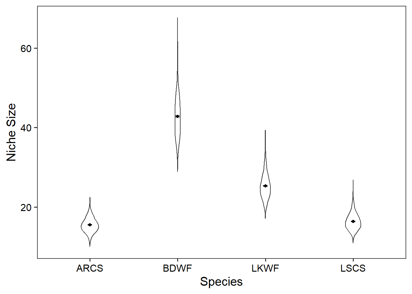
We are now going to estimate the overall size of the niche for each posterior sample by using the function extract_niche_size() which is a wrapper around niche.size() and some data manipulation functions.

niche_size <- extract_niche_size(fish_par)

We can calculate the mean niche size, standard deviation, and standard error.

niche_size_mean <- niche_size %>% 
  group_by(sample_name) %>% 
  summarise(
    mean_niche = round(mean(niche_size), digits = 2), 
    sd_niche = round(sd(niche_size), digits = 2), 
    sem_niche = round(sd(niche_size) / sqrt(n()), digits = 2)
  )

0.12 Plot niche size

We will now use geom_violin(), geom_point(), and geom_errorbar() to plot the distribution for niche size for each species.

ggplot(data = niche_size) + 
  geom_violin(
    aes(x = sample_name, y = niche_size),
    width = 0.2) + 
  geom_point(data = niche_size_mean, aes(x = sample_name, y = mean_niche)) +
  geom_errorbar(data = niche_size_mean, aes(x = sample_name, 
                                            ymin = mean_niche  - sem_niche, 
                                            ymax = mean_niche  + sem_niche), 
                width = 0.05) +
  theme_bw(base_size = 15) + 
  theme(panel.grid = element_blank(), 
        axis.text = element_text(colour = "black")) + 
  labs(x = "Species", 
       y = "Niche Size") 

Now that we have our niche sizes and similarities determined we can make inferences about the species, trophic similarities, and the ecosystem.